Showing posts with label diy. Show all posts

Monday, December 19, 2011

Japanese Cherry Blossom vinyl wall art

A while back we went on a shopping excursion to Ikea. I'm not a huge fan of Ikea; their products tend to be really cheap or really expensive. If you buy cheap, well, it looks and feels cheap. But if you can shell out the money for the good stuff, it's worth it. Yes, you get what you pay for. This gentleman's thoughts on Ikea pretty much sums it up. That said, I do enjoy their showroom floor; they offer great decorating tips. But when you start adding everything up, the price tag is staggering. So, I usually make my way to the bottom floor. That's where the deals are. Great prices in tea lights, candle holders, various kitchen utensils, picture frames, great things like that. Which is where I found these vinyl wall clings. 
We live in an apartment, and in typical apartment style, the walls are very white. Stark white. Insane asylum white! Unfortunately, painting isn't an option. Because the wall is blindingly white, anything on the walls really stand out. That's why I think these clings will look so cute! They're a light gray, so the branches will stand out, but not over-power the wall.


Wall before cleaning
Wall after cleaning


A real cherry blossom for inspiration

Vinyl cherry blossom as a guide

I searched the internet to get an idea for how cherry blossoms grow and look like. The above two pictures are the best I could find to use as an inspiration and a guide. 

Supplies you'll need.

Cut out the branches, flowers, and birds.

Close up details.

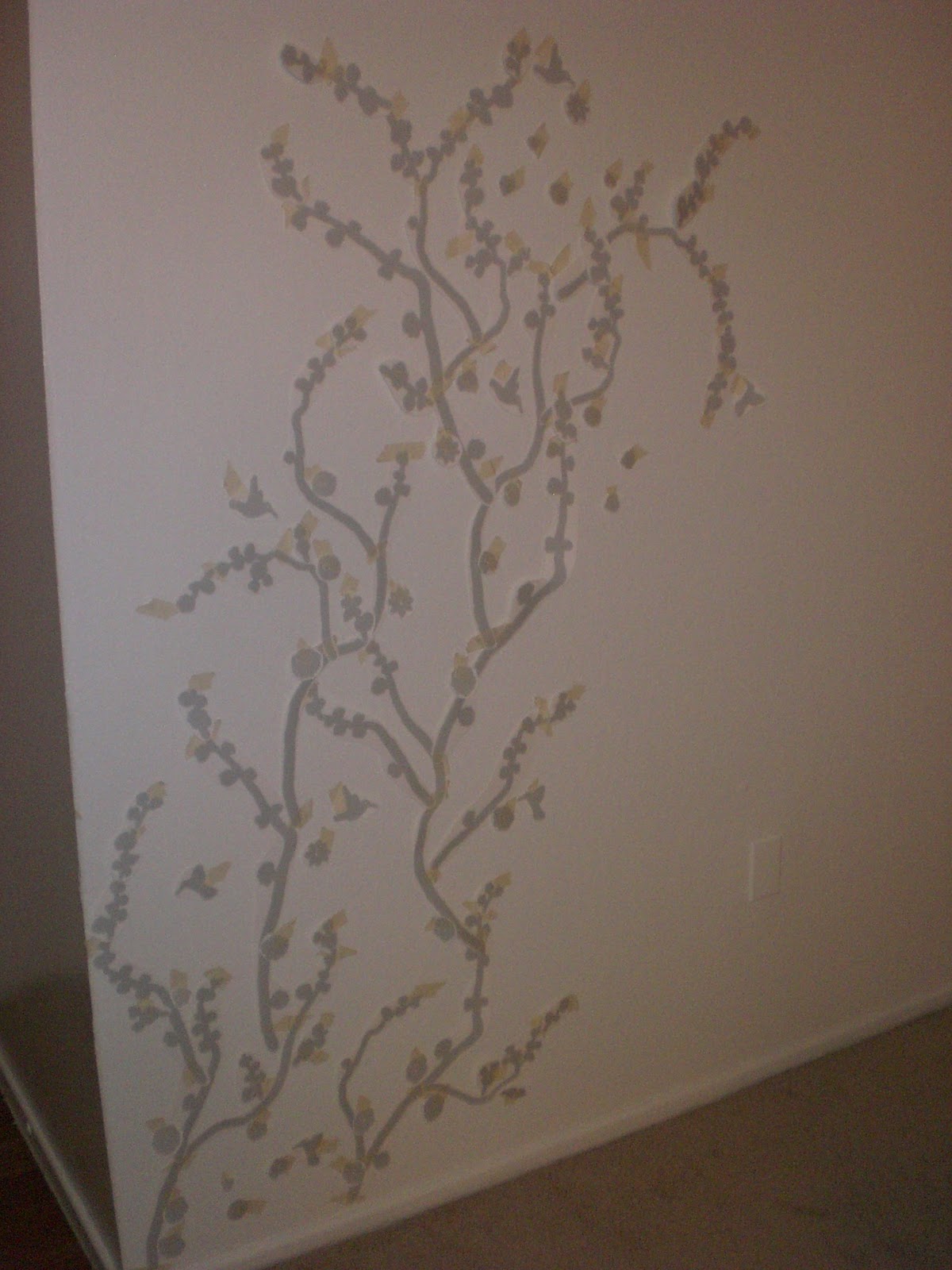
Final decision for layout.

Sloooowly coming together.

Done!

Humming bird


I've never done a project like this before, and I'm happy with the results. Pretty decent for my first time. Thankfully the adhesive isn't so tacky that it will damage the walls in our apartment. 

  1. Clean your wall or surface. Just a little soapy water is fine. You want to be sure that your surface is smooth, dry and free of dust and dirt. 
  2. While the wall was drying, I cut out all the pieces.
  3. Plan your layout. Arrange your vinyl on your surface using masking tape (top edge only), do not remove the white backing until you are happy with your layout. This makes it easier to fix and rearrange your design. Note: The vinyl is removable, but cannot be repositioned or reused.
  4. Once you're content with your design, it's time to apply the vinyl (I started from the bottom left corner and worked my way up). Carefully peel the white backing away from the transfer tape. As you lower the vinyl to your surface, carefully move your hand across the vinyl, starting at the top center and working your way out to the edges and bottom. With your scrapper, finish the application by rubbing over the vinyl to secure it to your surface and remove any air bubbles. Note: When I took the picture, I did not have an actual scrapper until my husband brought one home from work. Some websites state you can use a credit card, I would advise against this. The thin edge can cut and scrape in to the paint. Not to mention if you push too hard and break the card. A a plastic scrapper worked best.

  • Vinyl can be applied to walls, wood, glass, concrete, metal, or any other smooth, dry surface. 
  • As I was working my way from bottom to top, the branches and flowers didn't go back on in the exact same spot, this is why it's best to work bottom to top. You have more room to make adjustments.
  • Sometimes the masking tape can be very sticky. Make sure no residue gets left on the wall and that you don't rip your vinyl (this happened twice before I realized I should be a bit more careful).

Thursday, December 1, 2011

Ceramic owl

I discovered a cute little pottery place called As You Wish. They have a HUGE wall of assorted pottery pieces to pick from, then you paint it, and they fire it. Not only do they have a huge variety of ceramic pieces (plates, coffee mugs, piggy banks, different animals, the list goes on), but they have a wonderful paint selection in all colors. Matte paint, glossy, a pseudosparkle-type paint, and - my personal fav - puff paint!
I only took a pottery/ceramics class once. It was through the City of Troutdale back in, oh my, 2006 or 2007. Many moons ago! It was fun, and I always wanted to try it again. I also REALLY wanted to get out of the house and explore Phoenix a little bit, so this place was perfect. 

Once there, I was very much overwhelmed by all the pottery options.... Should I make a big serving plate (I don't have any and it would be fun to make my own)?, or perhaps a coffee mug to curl up with in the morning (because I don't have enough of those already)? I decided on this charming little owl.

Ceramic owl
When I saw that tiny face and big eyes, I fell in love! 
The girl working showed me all the point options and the best techniques. Light paint paint first, then darkest. I knew I wanted his (Her? I still haven't decided.) main color to be brown, so I had to make the rest of him as colorful as possible.  

Front view
I pictured bright glowing eyes. Every owl I've seen in the wild has had beautiful eyes. They are known for their great sight after all!
Next, it was time for his "feathers". Again, I needed colors that would pop against the deep brown. I chose a red-orange color for his body feathers and a medium purple for his wing feathers. His head begged to be a different color, and the girl as nice enough to explain to me how to "fade colors".

My sad attempt at "blending"
The idea was to paint one color, then while the first coat is still wet, paint the next color, and while that coat is still wet use the first color again, and so on. I understood the idea, I just had a little trouble putting it to use! Once the paint hits the pottery, it dries almost immediately. Next time, I'll work in smaller sections.


My finished attempt at blending. 

Finished before firing
The whole owl needed three coats of paint. The more layers of paint, the richer the color. 
They also have paint pens to use on your creation after painting is done and before it's fired. I decided to use black to make his eyes stand out a little more. I outlined his feet, the yellow and green in his eyes, then I colored in his pupils. I decided to add the black lines to define the green.... He was kinda creepy looking without it, personally.
Oh, I also had to give him eyebrows. My hand slipped while outlining his eye right eye - it's not like you can white-out the mistake! 

Finished rear view before firing
Inspection before firing. 


You can't inspect your work too many times...

DONE!
And here he is all finished!


I obviously missed a spot or two on him and my blending leaves something to be desired, but hey, it's only my second time. I think he's adorable! 
I can't wait to go back and paint other things! Not only do they have a massive in-house selection, but they have a catalog to order from.
My head is already filling with things to paint next!

Wednesday, August 18, 2010

Girl's Night Out Invitations

I saw the idea for these invitations in one of the MANY diy wedding books I bought. I loved the stuff in the middle - and the great thing is you can change the theme to fit the occasion! The invitations in the book were save-the-dates for a beach themed wedding. So the middle had sand and a starfish.... sooooo cute!
I knew I had to attempt to make these and I thought the perfect time would be for my friends birthday party. I had some Zebra print with pink invitations left over from another friends bachelorette party, I loved the Zebra, but I didn't need the middle. Then it hit me, cut out the middle and make the confetti invites! The supplies are really quite simple. I used a light pink for the back (cut 6"x8"). A medium dark purple for the invitation wording (cut 5.25"x7.5"). The Zebra invitation with the window came in 5"x7". The window dimensions are 1"x0.5". The transparency paper is cut to 4.5"x6". The hardest part was scaling the rest of the invitation to the zebra print. The invitations in the book were 4.5"x5.5".... Mine were much bigger due to the Zebra print.
Non-paper supplies are double-stick tape, double-sided foam adhesive strips, fun stuff for the middle, and cutting utensils.

Here is what Zebra invitation looked like at first.


Then I cut out the middle. I started to cut the middle out with a craft knife, but the blade was getting a little dull and I'm not confident in my cutting straight skills. Also, since I wasn't using the middle this time, I figure why not use it again another time! I used the craft knife to start the cut then I finished with scissors.


After I got all those cut out, I set them aside and moved on to the back. It's hard to tell what kind of pink I used, but it's light floral pink. This piece has to be about an inch or so bigger than the zebra print because the invitation is going to be layered. After I got those cut out, I cut the purple paper. Again, slightly smaller than the pink paper.

Once the pink and purple papers are cut, adhere them together with the double stick tape and set aside.

I set the window card on the purple paper BEFORE putting the translucent sheet on so I knew how much room I had to work with so I didn't cut off the writing. I'm proud I thought of that before I messed up :)


After that was done, I glued the translucent paper to the back of the zebra print card. A little glue is fine to the get translucent paper to stick well enough before you put the double-side foam tape on.
While still working on the back of the window card, set the double-side foam tape. *NOTE* If there are any gaps, then the inclusions could fall out!!!
Once the foam is placed, and your confident there are no gaps, remove the protective lining from both sides and the bottom - but leave the top piece. This will allow you to secure the window card in place, and pour in your inclusions.
Once the window frame is firmly in place, and the top is still open, insert the confetti (this is what I used). This is a situation where a little goes a looooong way. Trust me!


Now, remove the top protective lining and press the frame firmly in place. And you're done!!!

I tried to leave a little room at the bottom of the invite to allow room for the confetti to settle while still being able to read the words.
I am a little disappointed that the translucent paper I have really isn't all that translucent. The paper is marked translucent on the cover!! So, I'm on the look out for truly see-through "paper". I already have a few scrapbooking ideas in mind to use a technique like this!

I tried to explain this step-by-step as best I could. But, I'm happy to clarify a step if needed. It is my first official blog post after all :)